THE TASK
The competence development company DIEU has existed for more than thirty years, during which the company has worked on creating international growth. This has lead to an establishment of offices in Brussels, London and Berlin. Following the internationalisation of the company the name ”DIEU” created a number of challenges, one of which was that ”DIEU” means ”God” in French.
The task lay in developing a new company name and subsequently a new visual identity
DIEU wanted both the new name and the new visual identity to reflect the company’s Scandinavian roots and long history.
THE SOLUTION
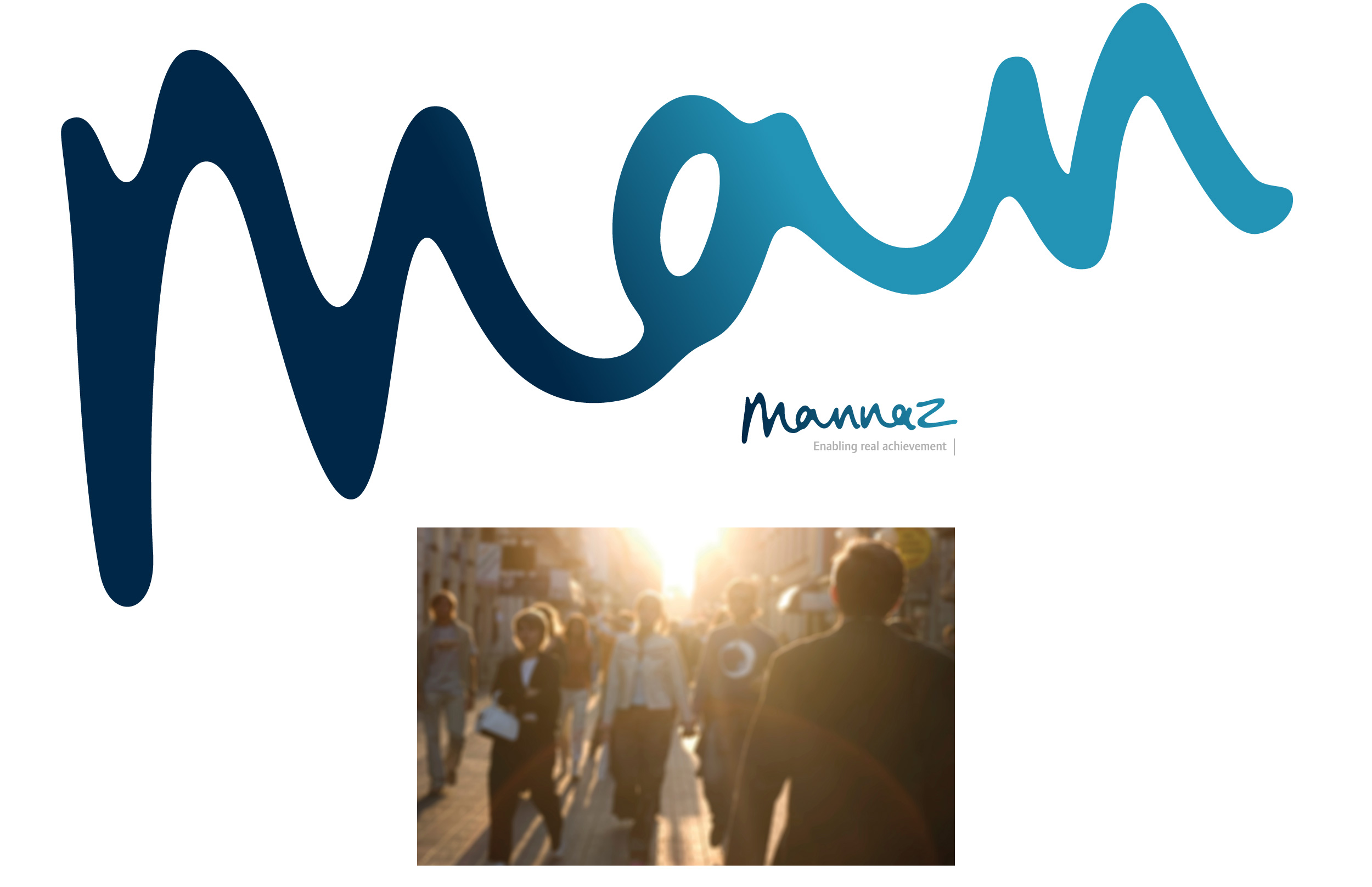
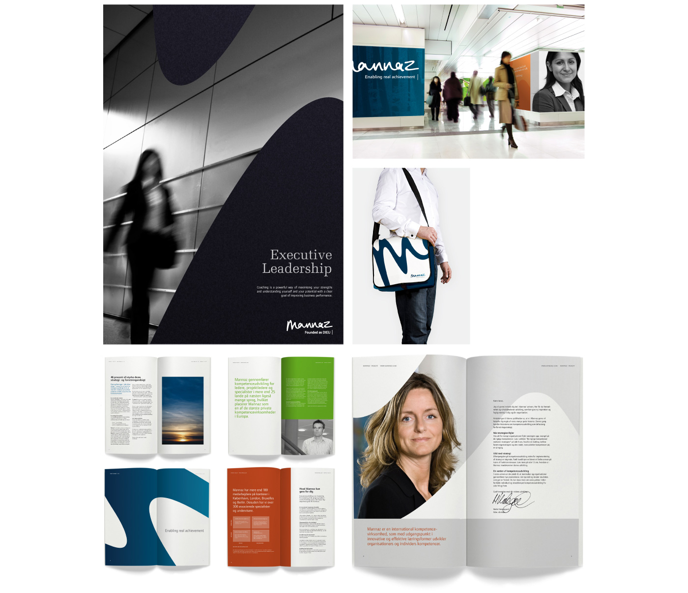
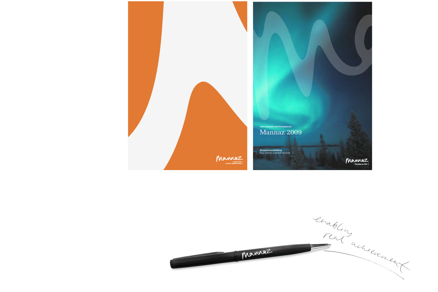
Mannaz is Proto-Germanic and means human.
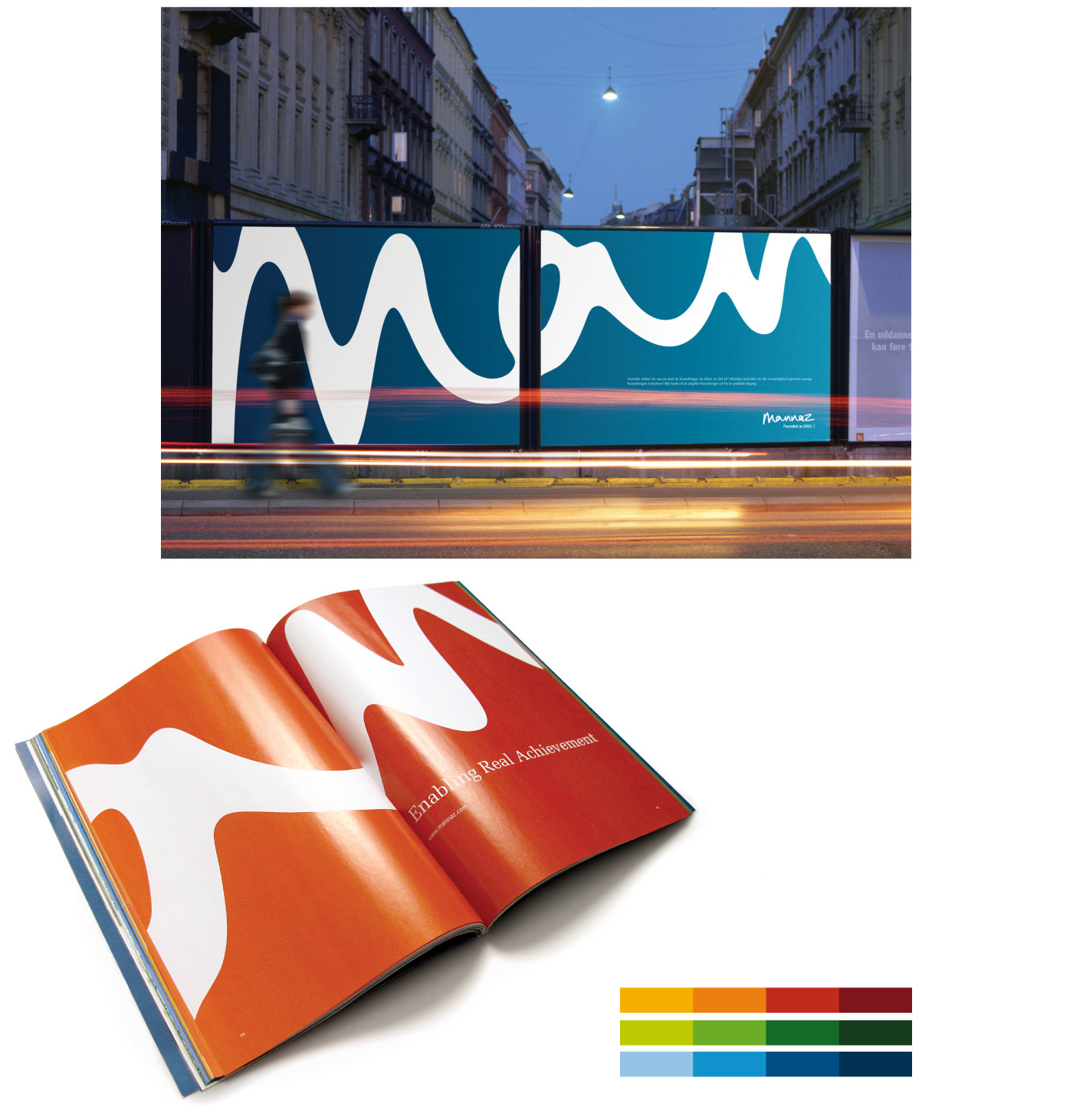
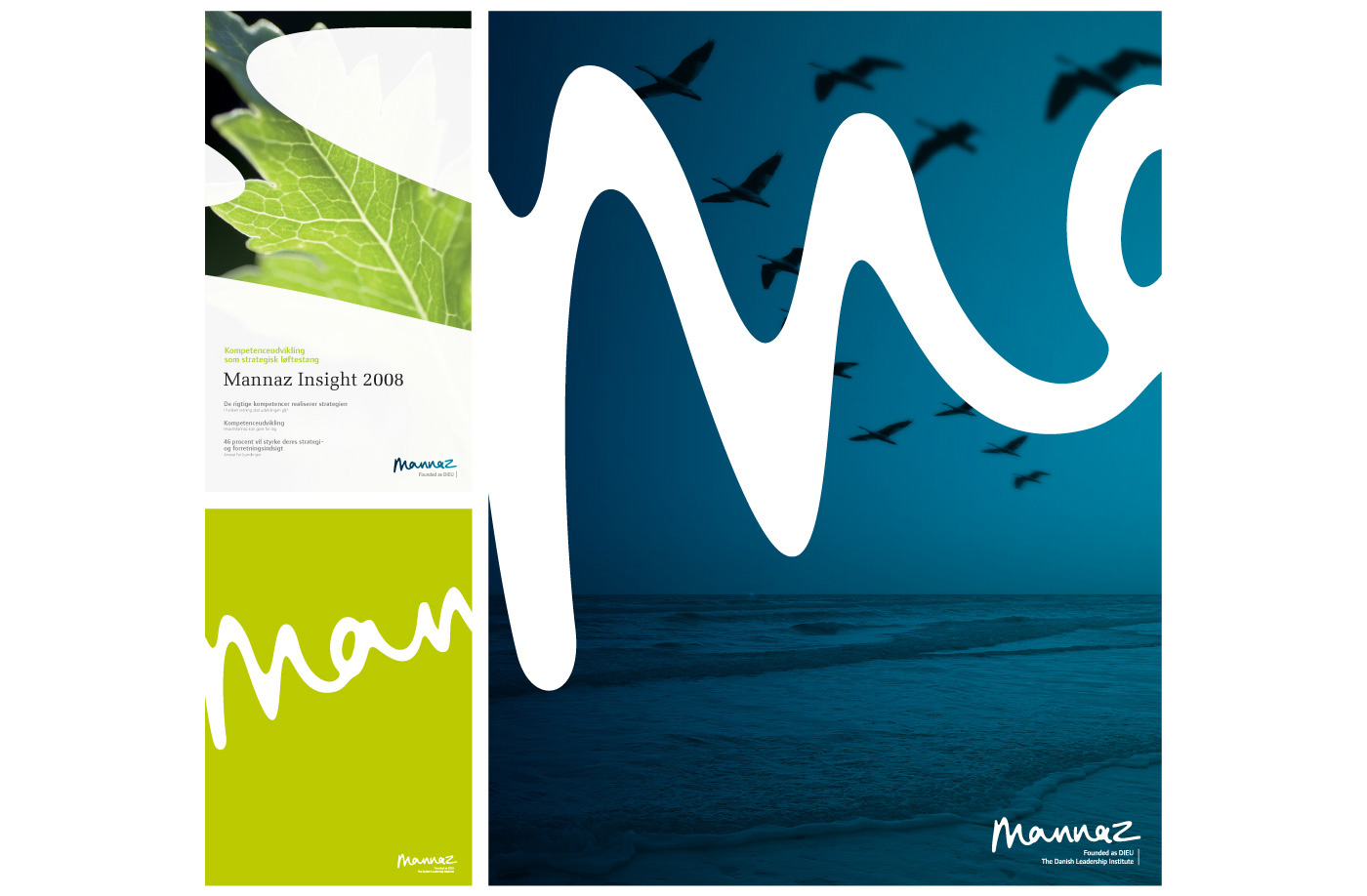
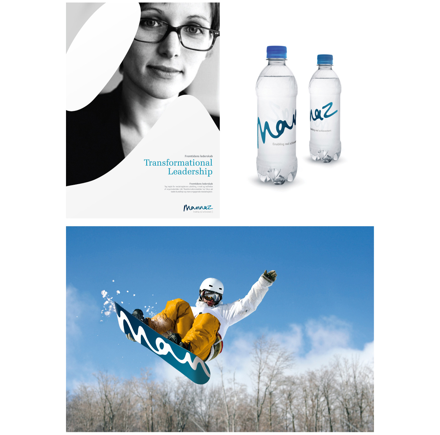
The logo is handwritten, which in itself carries the reference to the focal point of the company – the unique human being.
The logo contains both soft and hard values due to the combination of the organic form and the cool, blue colours. It is the underlying basis of the entire identity, and an inherent, recurrent visual element in the form of the graphical structure. The style of the photos and the colour palette supports and expresses the Scandinavian roots.